 | Information Architecture for the World Wide Web |  |

A complex web site often includes several types of navigation systems. To design a successful site, it is essential to understand the types of systems and how they work together to provide flexibility and context.
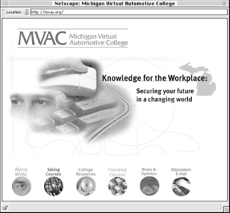
Although we may not typically think of it this way, the information hierarchy is the primary navigation system. From the main page to the destination pages that house the actual content, the main options on each page are taken directly from the hierarchy (see Figure 4-5). As noted earlier, the hierarchy is extremely important, but also rather limiting. It is these limitations that often require additional navigation systems.

A global or site-wide navigation system often complements the information hierarchy by enabling greater vertical and lateral movement throughout the entire site. At the heart of most global navigation systems are some standard rules that dictate the implementation of the system at each level of the site.
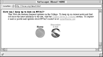
The simplest global navigation system might consist of a graphical navigation bar at the bottom of each page on the site. On the main page, the bar might be unnecessary, since it would duplicate the primary options already listed on that page. On second level pages, the bar might include a link back to the home page and a link to the feedback facility, as in Figure 4-6.

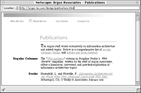
A slightly more complex global navigation system may provide for area-specific links on third level pages and below. For example, if a user explores the products area of the web site, the navigation bar could include Main Page, Products, and Search. The obvious exception to this rule-based system is that pages should not include navigation links to themselves. For example, the main page of the products area should not include a Products link. However, this is a great opportunity for the site's graphic designer to devise the navigation bar to show that you are currently on the main page of the products area. Designers often leverage a folder tab or button metaphor to accomplish this effect. (On the Argus web site, we use the @ sign from our corporate logo, as seen in Figure 4-7.)

As you can see, this type of rule-based global navigation system can easily be applied throughout the entire web site. The navigation system and the graphic design system should be integrated to provide both flexibility and context. Note that the relative locations of the options should remain the same from one version of the bar to another and that, since people read from left to right, Main Page should be to the left of the other options. Both these factors enhance the context within the hierarchy.
For a more complex web site, it may be necessary to complement the global navigation system with one or more local navigation systems. To understand the need for local navigation systems, it is necessary to understand the concept of a sub-site.[7] The term sub-site was coined by Jakob Nielsen to identify the recurrent situation in which a collection of web pages within a larger site invite a common style and shared navigation mechanism unique to those pages.
[7]Jakob Nielsen, The Rise of the Sub-Site. Sept, 1996 (http://www.useit.com/alertbox/9609.html.)
For example, a software company may provide an online product catalog as one area in their web site. This product catalog constitutes a sub-site within the larger web site of the software company. Within this sub-site area, it makes sense to provide navigation options unique to the product catalog, such as browsing products by name or format or market.
However, it is also important to extend the global navigation system throughout the sub-site. Users should still be able to jump back to the main page or provide feedback. Local navigation systems should be designed to complement rather than replace the global navigation system (see Figure 4-8).

This integration can be challenging, particularly when the global and local navigation systems provide too many options. Alone they may each be manageable, but together on one page, the variety of options may overwhelm the user. In some cases, you may need to revisit the number of global and local navigation options. In others, the problem may be minimized through elegant page design.
Relationships between content items do not always fit neatly into the categories of hierarchical, global, and local navigation. An additional category of ad hoc links is more editorial than architectural. Typically an editor or content specialist will determine appropriate places for these types of links once the content has been placed into the architectural framework of the web site. In practice, this usually involves representing words or phrases within sentences or paragraphs (i.e., prose) as embedded hypertext links. This approach can be problematic if these ad hoc links are important, since usability testing shows "a strong negative correlation between embedded links (those surrounded by text) and user success in finding information."[8] Apparently, users tend to scan pages so quickly that they often miss these less conspicuous links. You can replace or complement the embedded link approach with external links that are easier for the user to see.
[8]Spool et al., 41-42.
The approach you use should be determined by the nature and importance of the ad hoc links. For non-critical links provided as a point of interest, embedded links can be an elegant, unobtrusive solution.
When using ad hoc links, it's important to consider whether the linked phrase provides enough context for the user. In Figure 4-9, it's fairly obvious where the Digital Dissertations Pilot Site link will take you. However, if 1861 or 1997 were underlined, you would be hard pressed to guess where those links would lead. In designing navigation systems for the Web, context is king.


Copyright © 2002 O'Reilly & Associates. All rights reserved.