 | Information Architecture for the World Wide Web |  |

Metaphor can be a powerful tool for communicating complex ideas and generating enthusiasm. By suggesting creative relationships or by mapping the familiar onto the new, metaphor can be used to explain, excite, and persuade. In 1992, vice-presidential candidate Al Gore popularized the term information superhighway. This term mapped the familiar and respected metaphor of the physical highway infrastructure of the United States onto the new and unfamiliar concept of a national information infrastructure. Gore used this term to excite the voters about his vision for the future. While the term did oversimplify and has since been horribly overused, it succeeded in helping people to begin learning about and discussing the importance and direction of the global Internet.
Three types of metaphor can be applied in the design of web sites. These are organizational, functional, and visual metaphors:
Organizational metaphors leverage familiarity with one system's organization to convey quick understanding of a new system's organization. For example, when you visit an automobile dealership, you must choose to enter one of the following departments: new car sales, used car sales, repair and service, or parts and supplies. People have a mental model of how dealerships are organized. If you're creating a web site for an automobile dealership, it may make sense to employ an organizational metaphor that draws from this model.
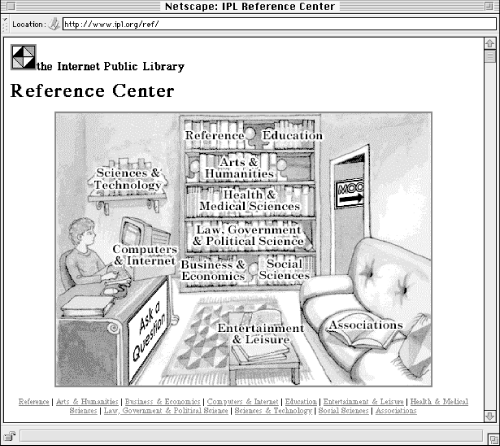
Functional metaphors make a connection between the tasks you can perform in a traditional environment and those you can perform in a new environment. For example, when you enter a traditional library, you can browse the shelves, search the catalog, or ask a librarian for help. Many library web sites present these tasks as options for users, thereby employing a functional metaphor.
Visual metaphors leverage familiar graphic elements such as images, icons, and colors to create a connection to the new. For example, an online directory of business addresses and phone numbers might use a yellow background and telephone icons to invoke a connection with the more familiar print-based yellow pages.
The process of metaphor exploration can get the creative juices flowing. Working with your clients or colleagues, begin to brainstorm ideas for metaphors that might apply to your project. Think about how those metaphors might apply in organizational, functional, and visual ways. How would you organize a virtual bookstore or library or museum? Is your site more like a bookstore or a library or a museum? What are the differences? What tasks should users be able to perform? What should it look like? You and your colleagues should cut loose and have fun with this exercise. You'll be surprised by the ideas you come up with.
After this brainstorming session, you'll want to subject everyone's brilliant ideas to a more critical review. Start populating the rough metaphor-based architecture with random items from the expected content to see if they fit. Try one or two user scenarios to see if the metaphor holds up. While metaphor exploration is a useful process, you should not feel obligated to carry all or any of the ideas forward into the information architecture. The reality is that metaphors are great for getting ideas flowing during the conceptual design process, but can be problematic when carried forward into the site itself.
For example, the metaphor of a virtual community has been taken too far in many cases. Some of these online communities have post offices, town halls, shopping centers, libraries, schools, and police stations. Figuring out what types of activities take place in which "buildings" can be a real challenge for the user. In such cases, the metaphor hampers usability. As an architect, you should ensure that any use of metaphor is empowering and not limiting (see Figure 8-2).

You should also go into this exercise understanding that people tend to fall in love with their own metaphors. Make sure everyone knows that this is just an exercise and that it rarely makes sense to carry the metaphor into the information architecture design.

Copyright © 2002 O'Reilly & Associates. All rights reserved.